
Pantone And Brand Color Matching For Custom Apparel
Color is one of the fastest ways people recognize a brand, which makes it one of the most important decisions in a custom polo or quarter-zip project. The strongest starting point is an official Pantone reference or documented brand standard—not a color guessed from a phone screen or an old garment.
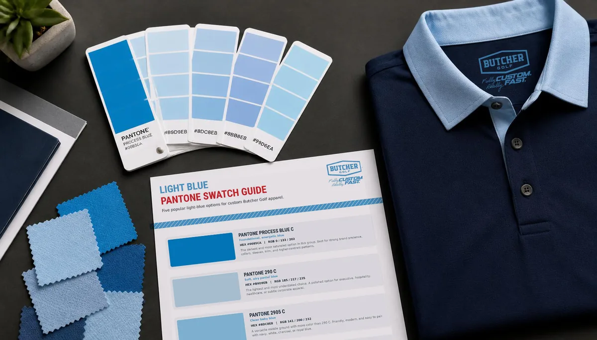
Pantone Preferred
A clear physical color reference
Digital Values
Helpful for artwork and screen review
Fabric Matters
Material and production affect appearance
Approval First
Color direction is confirmed before production
The Short Answer
Butcher Golf uses the best brand-color information available to build the approved apparel artwork. Pantone references are preferred because they provide a standardized physical target. HEX, RGB, CMYK, logo files, digital swatches, and brand guidelines are also useful, but they describe color in different systems and should not be treated as identical.
The final garment is a printed textile, not a backlit screen or coated paper sample. Fabric composition, dye behavior, lighting, pattern contrast, surrounding colors, and production conditions can all influence how the finished color appears. The goal is a careful, faithful translation of the brand—not a promise that every device, swatch book, material, and lighting condition will display color in exactly the same way.
Why Pantone References Are Valuable
The Pantone Matching System gives designers and manufacturers a common physical reference. Instead of asking for "our light blue" or sampling a screenshot, a company can identify a specific swatch from an official guide.
That reference helps because:
- It gives everyone a named target rather than a subjective description
- It reduces dependence on individual screen settings
- It makes brand guidelines easier to interpret
- It supports more consistent decisions across design revisions and reorders
- It provides a practical point of comparison when reviewing production options
A Pantone code does not mean the fabric will behave exactly like ink printed on coated paper. It does mean the conversation begins from an established standard rather than a guess. Colors sampled from an AI-generated concept are an approximation for the same reason, which is why we ask for your documented brand values alongside the concept — how AI concepts become real custom polos.
How Digital Color Values Fit In
HEX and RGB
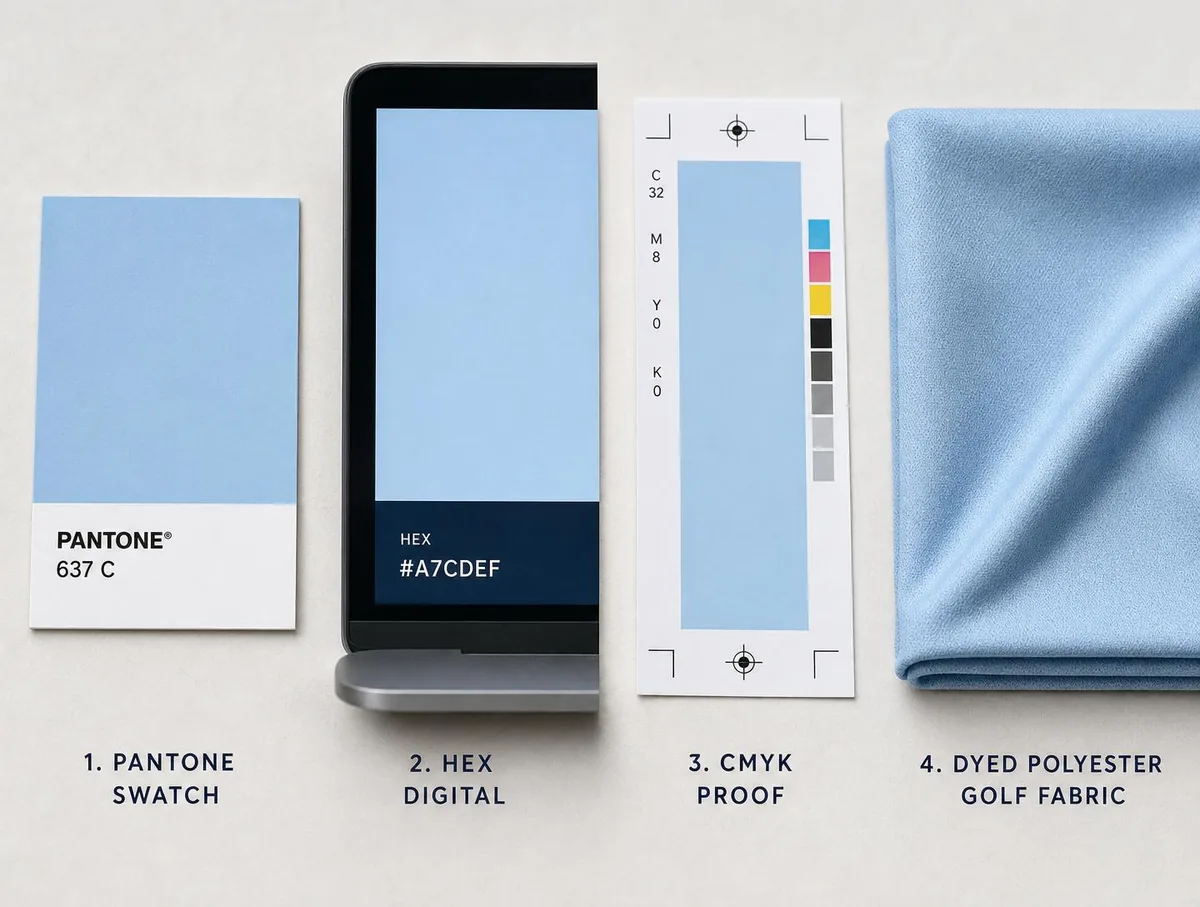
HEX and RGB values describe light displayed on screens. They are essential for websites, apps, digital presentations, and on-screen brand systems. They are useful during apparel design because the concepts are reviewed digitally, but the same value can appear different from one monitor, tablet, or phone to another.
CMYK
CMYK values are created for process printing with cyan, magenta, yellow, and black inks. They may be part of a company's print guidelines, but a CMYK formula is not a universal textile formula. It remains a helpful reference rather than a guaranteed fabric result.
Logo files and sampled colors
When official values are unavailable, colors can be sampled from an approved logo file. The usefulness of that sample depends on the file. A vector logo with defined values is more reliable than a compressed JPEG copied from a website or presentation.
Send every official source you have. The design team can compare them and identify the most appropriate working reference.
Our logo-file guide explains which asset formats are most useful for custom apparel.
Why The Same Color Can Look Different
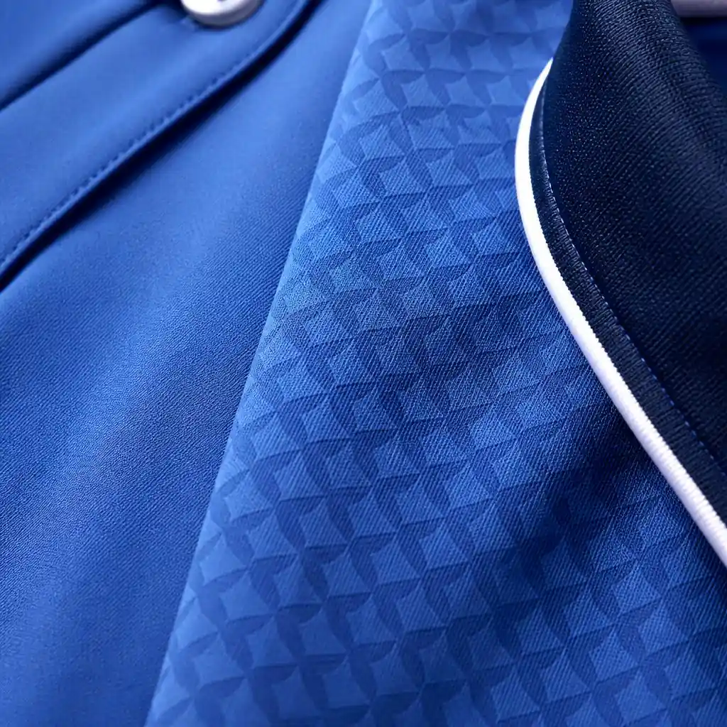
Color is experienced in context. The same blue can look lighter next to navy, darker next to white, or more saturated when repeated across a large garment panel.
Several factors affect perception:
- Screen brightness and calibration
- Indoor, outdoor, fluorescent, and warm ambient lighting
- The texture and sheen of performance fabric
- Solid color versus a small repeating pattern
- The color directly beside it
- The size of the printed area
- Garment folds, shadows, and body movement
- Differences between physical swatches, paper printing, and textiles
This is why a digital apparel comp should be treated as an accurate design guide rather than a perfectly calibrated physical proof on every device. It confirms artwork, layout, relative color relationships, pattern, and placement. Final color is experienced on the finished fabric.
If you have a Pantone color that needs matching, we will supply digital production proof images with your sew out beside a Pantone chip for visual approval. If time allows, we can provide a sew out printed proof in-hand for an additional $150.
Our Practical Color Workflow
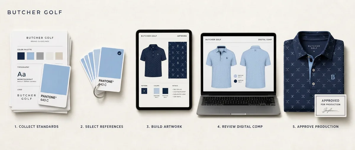
- 01
Collect Official Standards
Send Pantone references, brand guidelines, vector logos, color values, and approved examples.
- 02
Select Working References
Identify the primary, secondary, accent, neutral, and background colors required for the garment.
- 03
Build The Artwork
Apply the palette to patterns, solid panels, collars, sleeves, plackets, cuffs, trim, and logos.
- 04
Review The Digital Concept
Evaluate whether the color relationships and hierarchy feel correct for the brand and intended use.
- 05
Approve Before Production
Final artwork approval authorizes the design to move into printing, cutting, and sewing.
When a physical pre-production review is important, ask about the current sewn-sample option, cost, and timing before approving the project. A sample adds an approval step, and the normal production timeline begins after the sample and final artwork are approved.
Using Color Across A Custom Garment
A custom apparel palette is not simply a list of approved colors. The design has to decide where each color belongs and how much visual weight it should carry.
Primary color
The dominant color usually establishes immediate brand recognition. It may cover the body, appear as the pattern background, or anchor the largest solid panels.
Secondary color
A secondary color can organize sleeves, collars, side panels, cuffs, or plackets. It should support the primary color rather than compete with it.
Accent color
A small amount of accent color can add energy at buttons, zipper trim, piping, cuff edges, inside collars, or selected graphic details. Accent colors are often most effective when they are used sparingly.
Neutrals
White, gray, navy, black, and other neutrals create breathing room. They can make a bright palette easier to wear and give a featured logo or pattern a cleaner background.
See how custom polo color blocking uses these roles across collars, sleeves, bodies, cuffs, and plackets.
Color In Patterns And Logos
A branded pattern often needs a different color strategy from a featured logo.
A chest logo may need enough contrast to remain immediately legible. The same logo used as a repeat can be softened so it reads as texture. That may mean using two related shades of blue, reducing the contrast between motif and background, or allowing only one element inside the mark to remain bright.
The design team also considers whether the company's full-color logo should appear exactly as supplied or whether an approved one-color version would sit more cleanly on the garment. Alternate logo versions should come from the brand owner whenever possible.
Our branded pattern design guide explains how scale and contrast work together.
What To Send For The Best Color Direction
- Official Pantone references, including coated or uncoated notation when available
- Current brand guidelines
- Vector logo files with defined colors
- HEX, RGB, and CMYK values used by the company
- Approved one-color and reverse logo versions
- A description of which color should dominate the garment
- Any colors that should be avoided
- Photographs of existing branded environments, vehicles, packaging, or uniforms when helpful
- The intended setting, because an event polo may support more contrast than an executive uniform
Do not worry if your materials are incomplete. Send the best available files and clearly identify which source is considered authoritative inside your organization.
Color Planning For Reorders And Collections
Documented color references become more valuable over time. They help keep future orders, coordinated polo and quarter-zip collections, and related designs anchored to the same approved direction.
Textiles and production runs can still show normal variation. The objective is disciplined continuity: use the same approved references, preserve the artwork, and avoid restarting color decisions from screenshots or memory.
This matters when a company adds new employees, expands a uniform program, creates a cold-weather companion piece, or returns for a later event. A clear color record makes the next project faster and more consistent.
Common Questions
Still deciding? Tell us about your project and we'll answer specifics for your brand.
Start Your Design- Do you need Pantone colors to start a project?
- Pantone references are preferred, but they are not required. Brand guidelines, vector logo files, HEX values, digital swatches, and approved examples can also help establish the color direction.
- Will a digital comp look exactly like the final fabric on my screen?
- Not on every device. Screens vary in brightness and calibration, and backlit color behaves differently from printed textile. The digital comp is used to approve the design, placement, pattern, and intended color relationships.
- Can you sample colors from our logo?
- Yes, especially from vector artwork with defined values. Sampling from a compressed JPEG or screenshot is less reliable, so official brand values should be provided when available.
- Can a physical sewn sample be reviewed before production?
- A sewn sample may be available before full-production approval. Ask about the current cost and timeline when requesting a quote. The normal production timeline begins after the sample and final artwork are approved.
- Can the same colors be used across polos and quarter-zips?
- Yes. The designs can be developed as a coordinated collection using the same approved palette, pattern, and logo hierarchy while adapting the artwork to each garment's construction.
Related Design Studio Guides
Logo Files for Custom Apparel
Which brand assets and file formats produce the cleanest custom apparel artwork.
Branded Pattern Design
How logos, icons, and graphics become wearable repeat patterns at the right scale and contrast.
Custom Polo Color Blocking
Using collars, sleeves, bodies, cuffs, plackets, and trim as deliberate parts of the design.
Custom Apparel Design Process
What to send, how concepts are developed, and what happens between approval and delivery.
Start With The Best Brand Standards You Have
Send your logo, official color references, and any brand guidelines. Butcher Golf will use them to build a custom polo or quarter-zip palette that feels deliberate, recognizable, and appropriate for the people wearing it.
Written and reviewed by the Butcher Golf design team. Last reviewed: August 6, 2026.